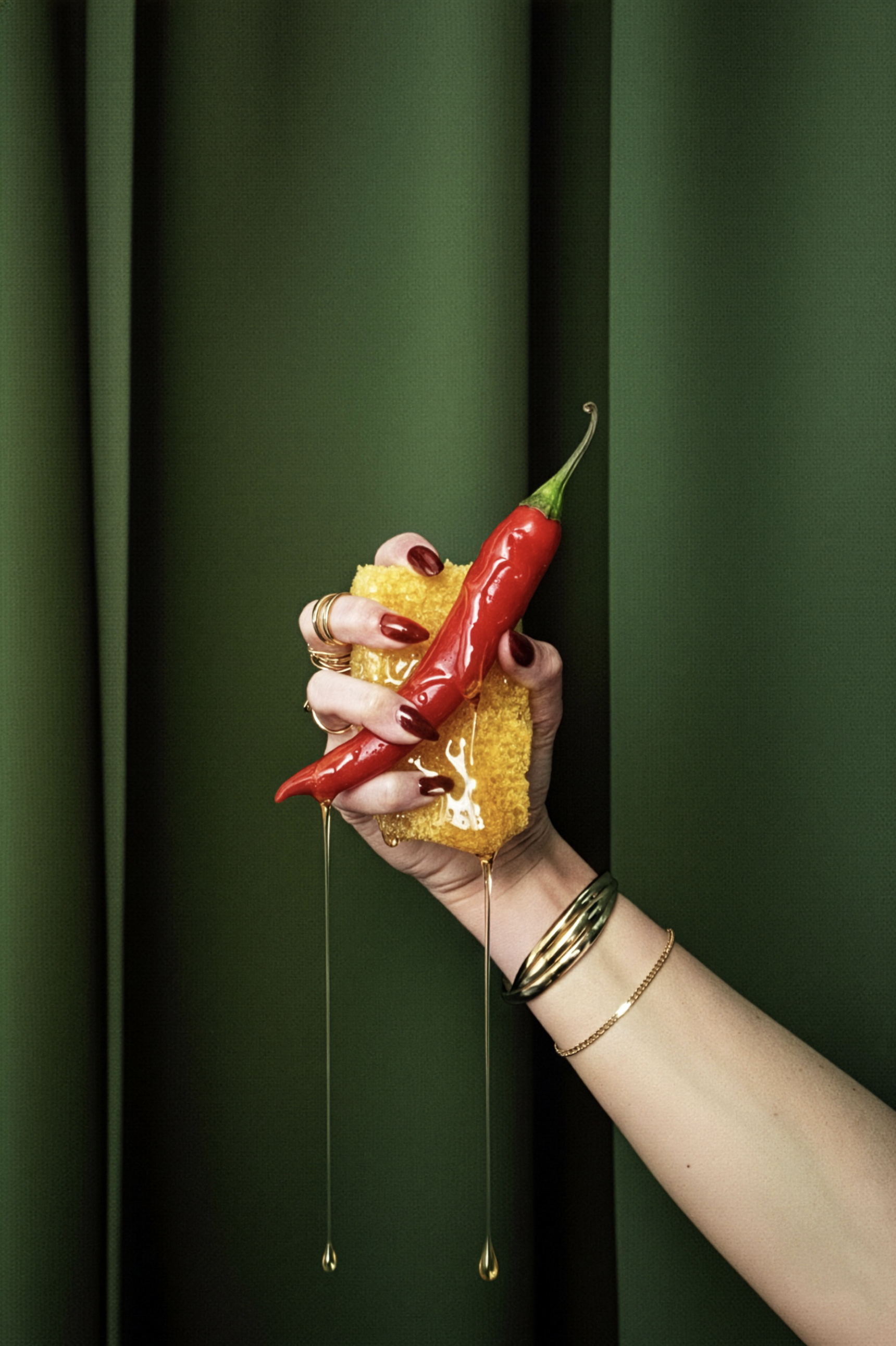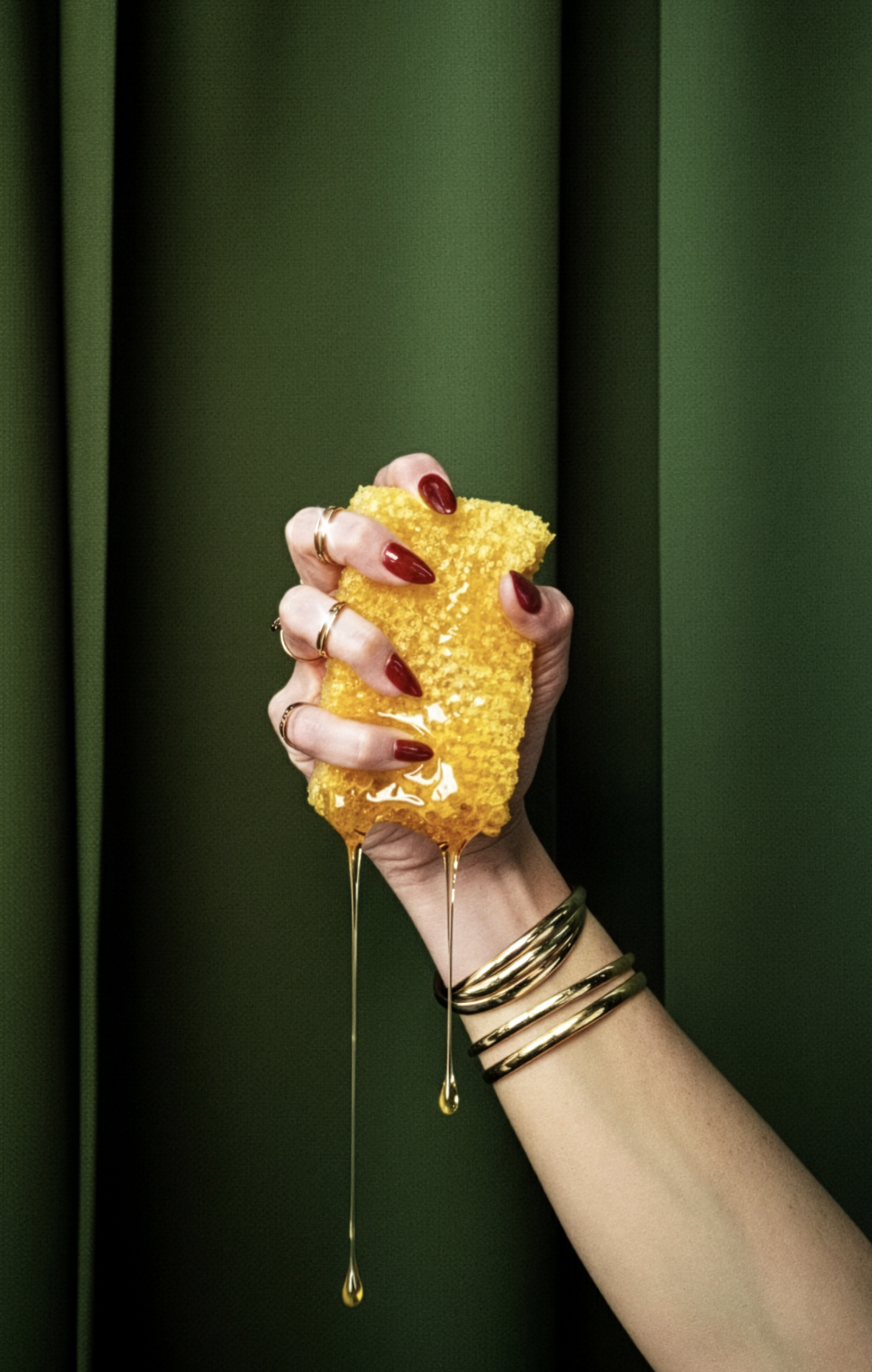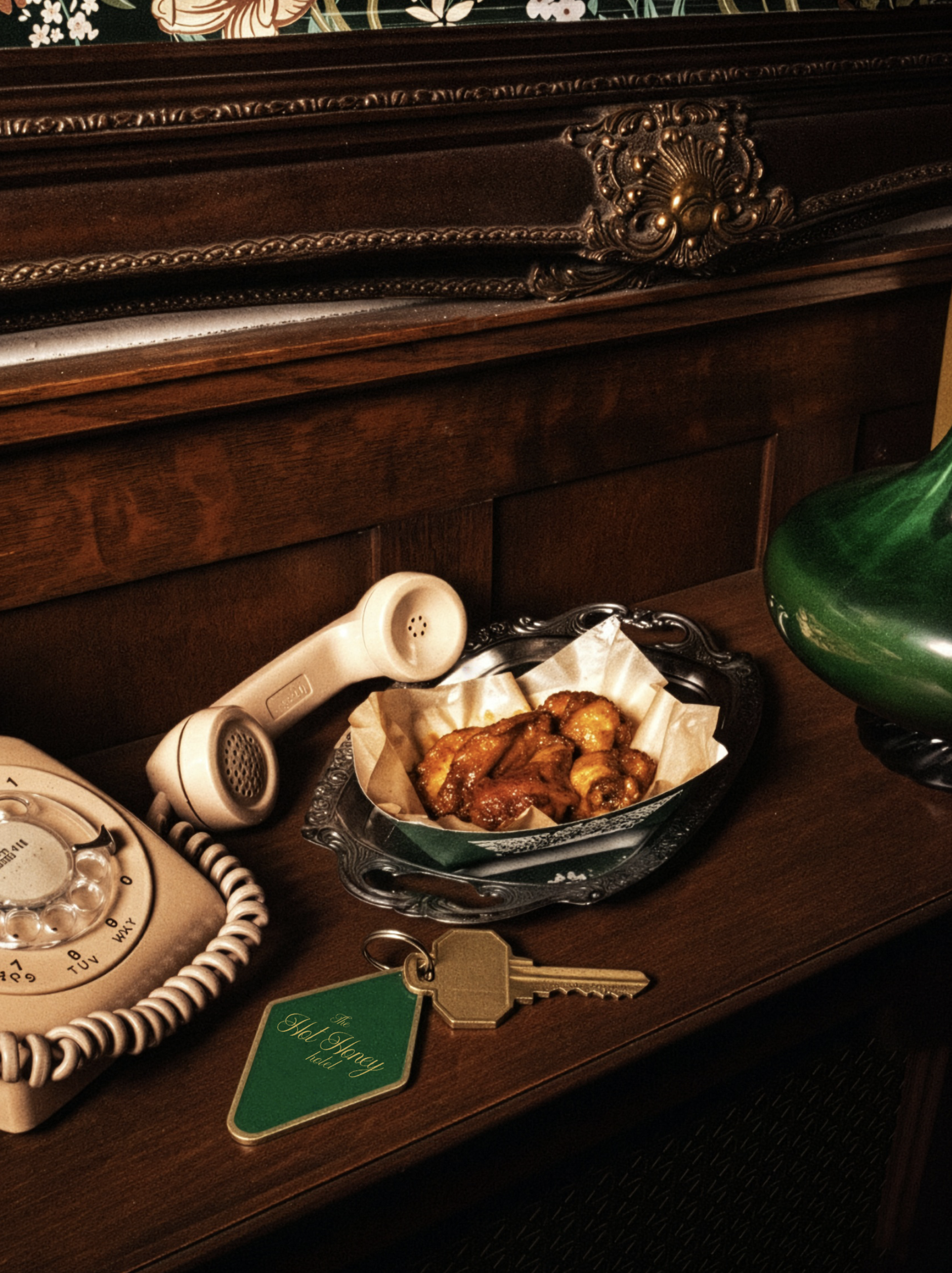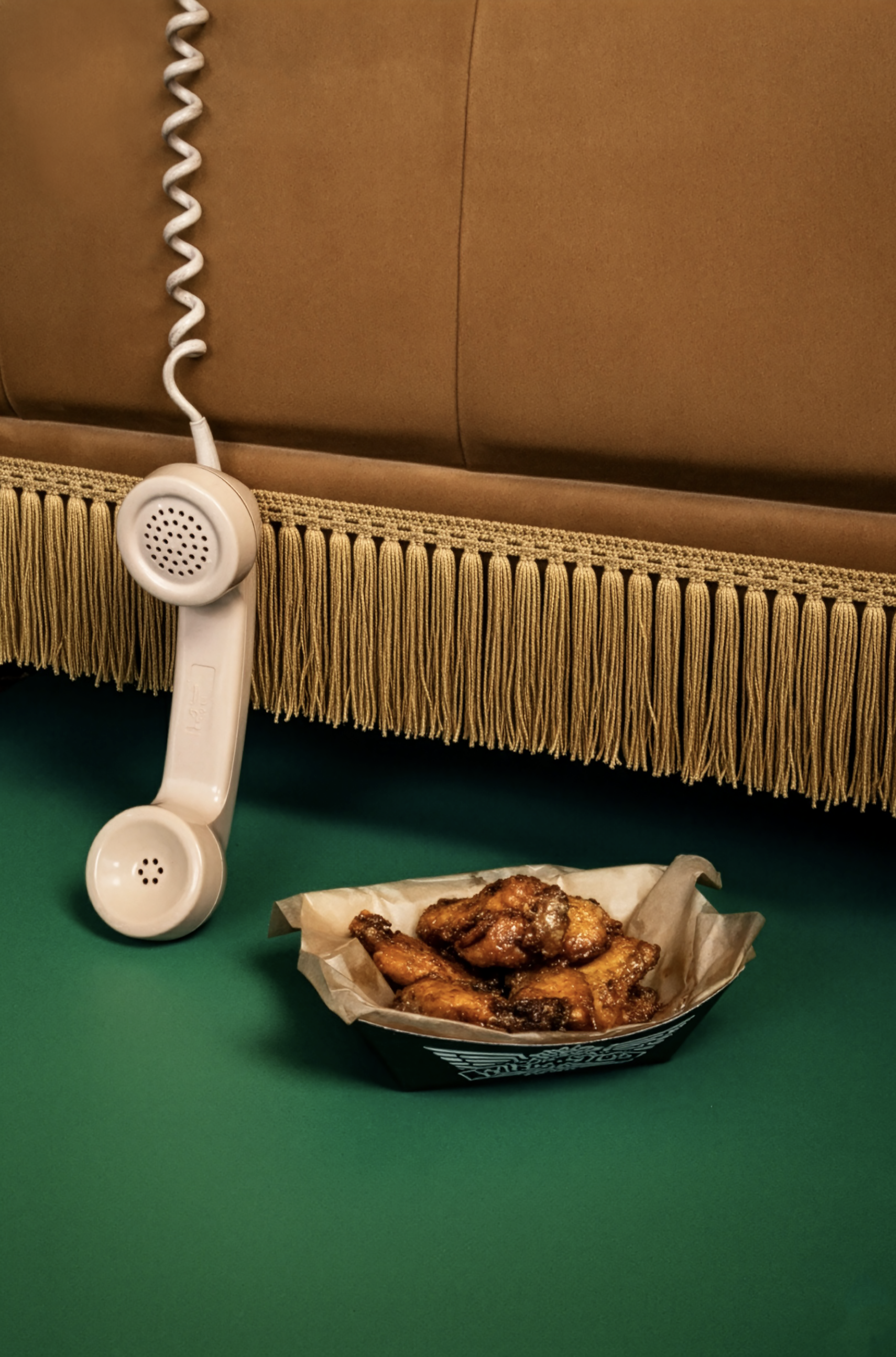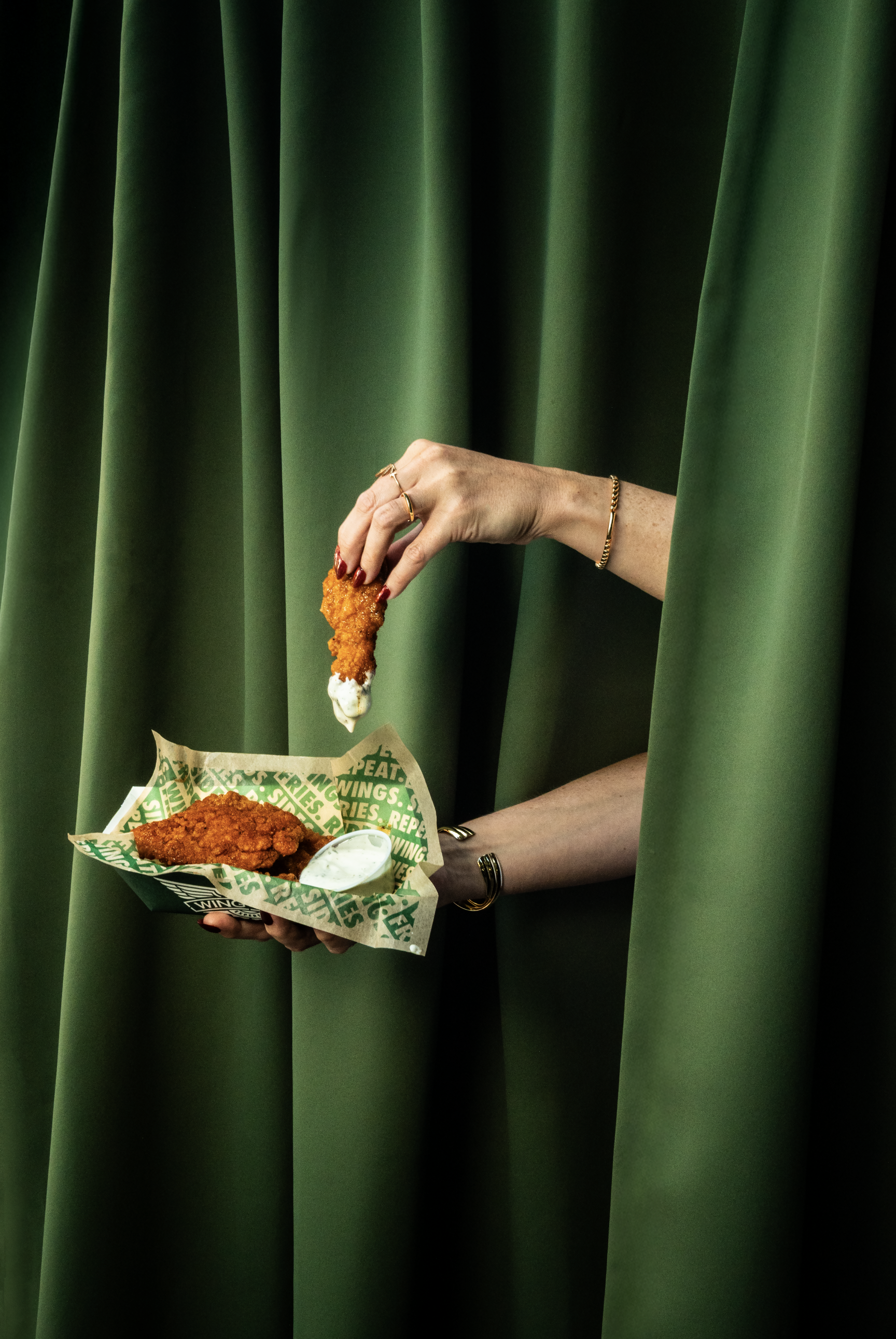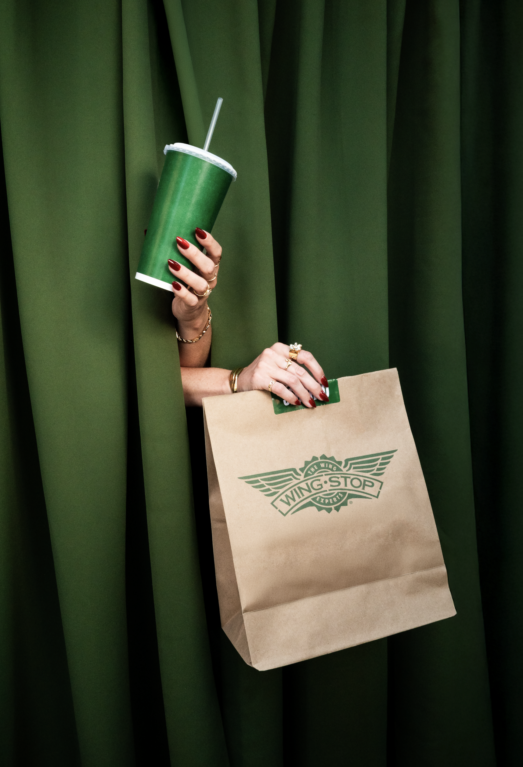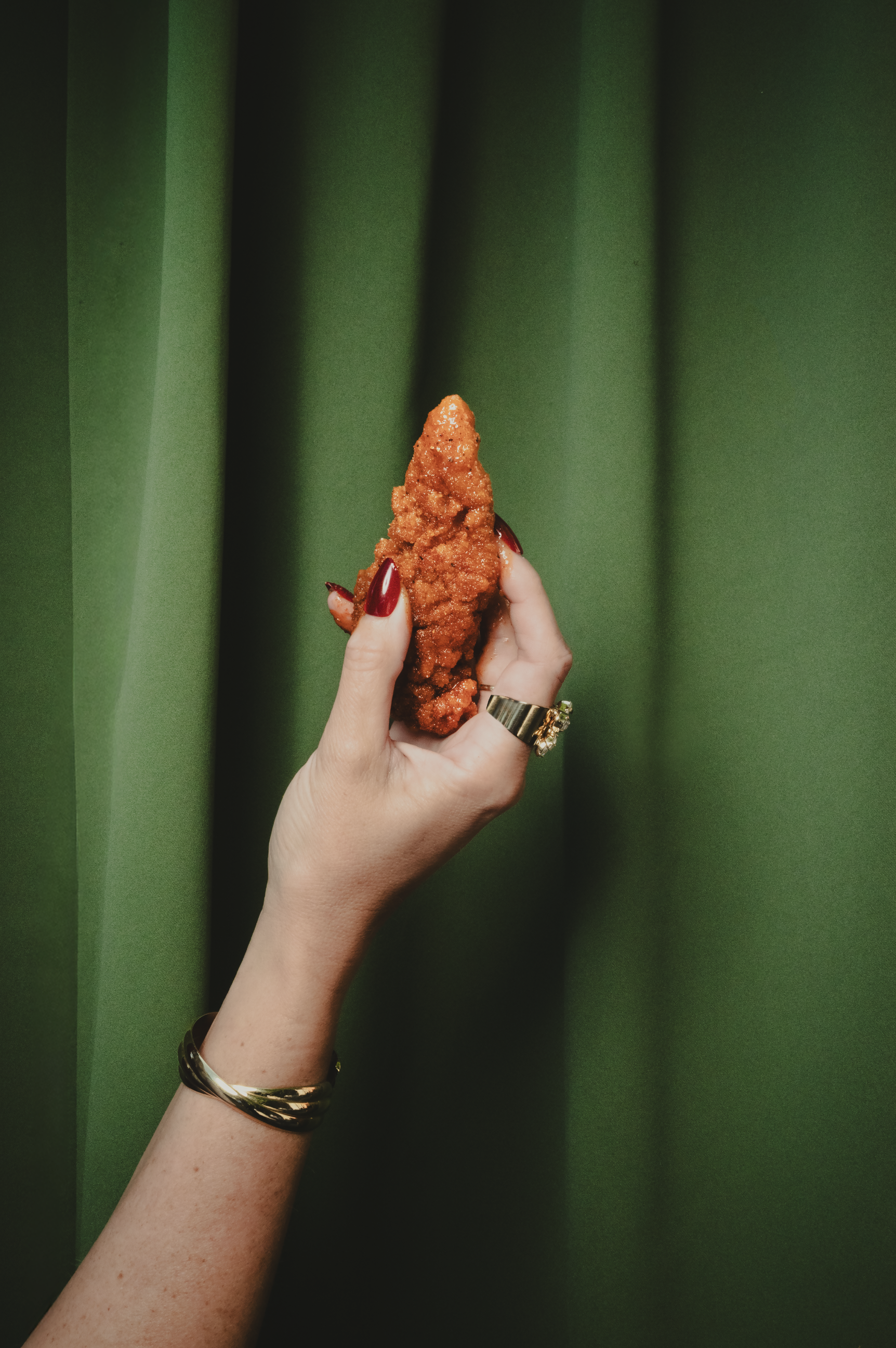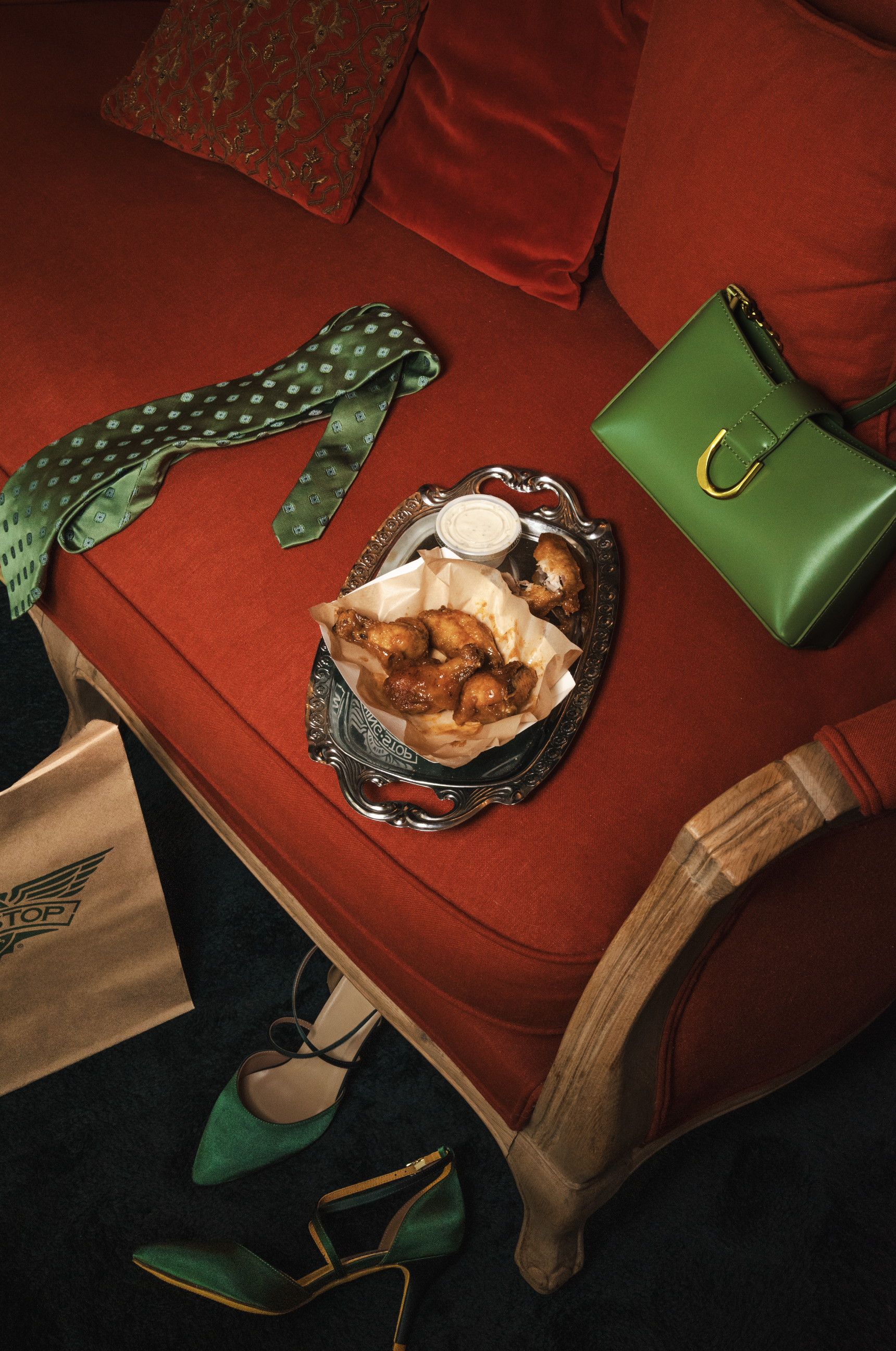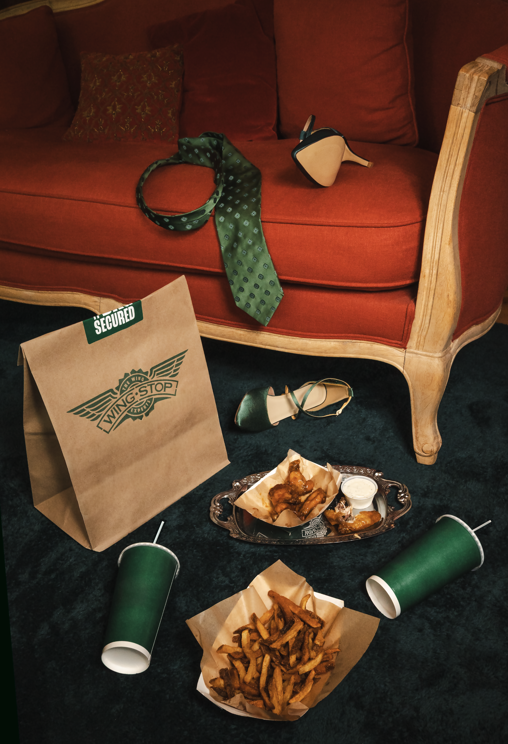
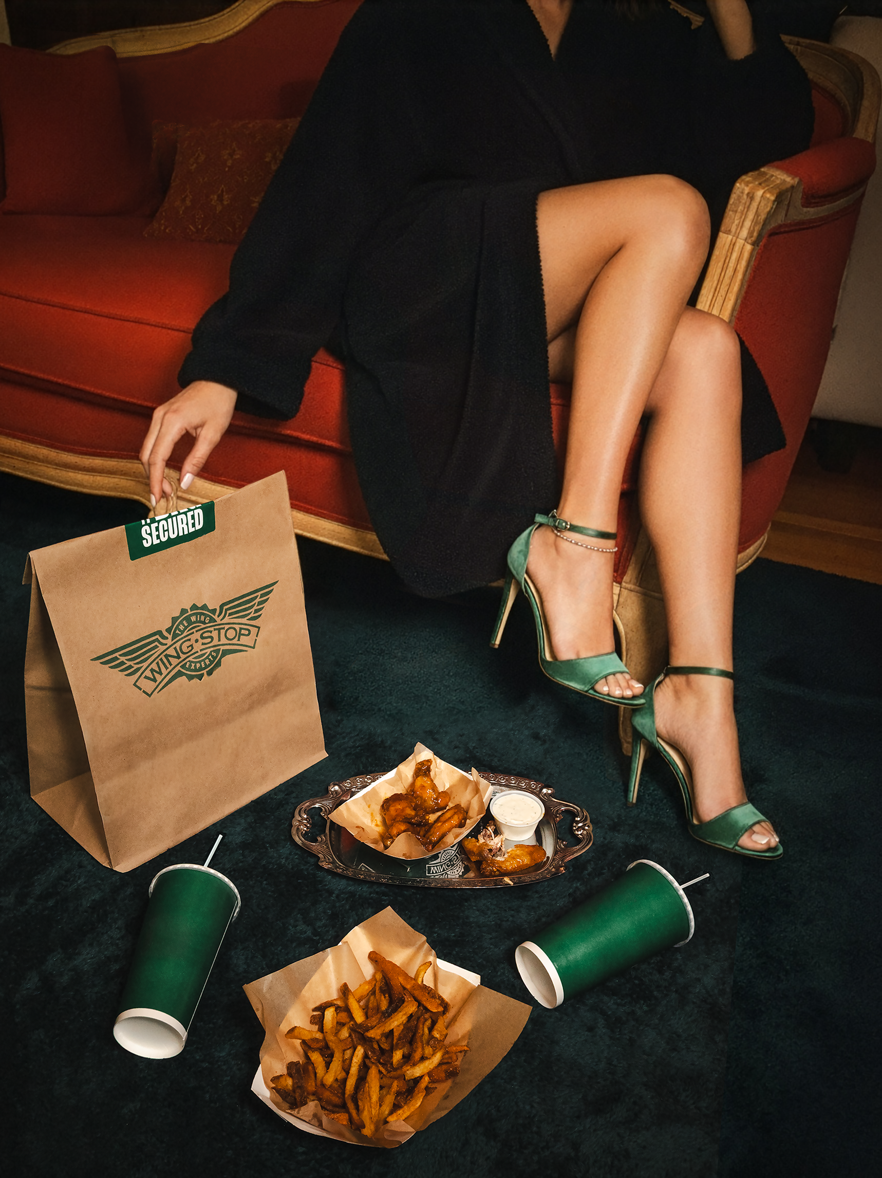
The Hot Honey Rub flavour at Wingstop blends retro coolness with modern boldness, reflected perfectly in its creative direction. The imagery—warm golden tones, vintage props, and a playful yet refined setup—evokes a sense of nostalgia and heat. It’s stylish but approachable, capturing the flavour’s sweet-meets-spicy personality. The branding leans into Wingstop’s confident tone: a little bit classy, a little bit rebellious, and full of flavour that speaks for itself—smooth, sticky, and unforgettable.
The campaign centres around the duality of the Hot Honey flavour — smooth honey sweetness colliding with fiery heat. The creative direction leans into contrast: warmth vs. intensity, nostalgia vs. bold modern flavour. The tone is confident, playful, and stylishly retro, positioning Wingstop not just as a wing brand but as a flavour lifestyle.